Designing for Animation Part 1: What Can Animate?

Deciding what to animate as a designer can be difficult, particularly because everything you do has to be expressed in code. And not everything can be. This post is first in a series that aims to help you identify some things you might like to keep in mind when designing for interactions:
Time & Money
Every animation you add to a site cost money. This is because developers will have to spend coding the animation. So the first step in analysing what can animate is a budgetary one. You could ask:
- How much value will this create for my client?
- What positive effect will this animation have on the users?
- Can I sell this to my client?
Performance
The length of time it takes for a website to load can impact hugely on it’s ability to do it’s job. There have been studies conducted by Google that show clearly that people are willing to wait an average of 3 seconds before they give up and shop elsewhere. Your developer will have some influence over this factor, but as a designer you are also responsible for designing with performance in mind.
Appropriateness
Animations can go from being awesome to being gimmicky very quickly. If it’s too slow, too fast, it can become obnoxious and turn people off. Often subtle animations that don’t shout too much, or ones that help users connect UI elements together work best. Just because it can be done, doesn’t mean it should be.
Telling a Story
Marc Davis, animator at Walt Disney Studios, is famous for saying that “animation had been done before, but stories were never told.” Animations can tell a story like no other medium. It can deeply affect people so that they create an emotional attachement to the subject. This powerful force can be leveraged in a pleasant and non-creepy way by the effective use of animation.
Section 2: Important Considerations
a) Don’t Hide Important Stuff
It can be tempting to hide UI elements, and reveal them when they’re hovered over by a visitors’ mouse. Whilst this is a cool effect, it can be a very dangerous practice: it can hide content that should be obvious to people. If an image links to another page, it should also display a clear label about where it’s going. Otherwise many people won’t be able to find it. Also, what happens to that element when the user has no mouse with which to hover? For example, they’re using their keyboard to navigate, or their thumb on a touch-screen device.

This is what you see when you hover over the image
Your user might say: “Ah, a nice translucent overlay with some information about this post. I could click on that. Yes I think I might.”

How do I know what this is?
Your user might say: “I’m skeptical that this is anything but a nice image to look at. I might try to hover over it, but my trust in this UI element is already diminished.”

Give us a clue!
Your user might say: “Ah, so this is a post about something I’m interested in, what happens if I hover my mouse over it? Oh! it’s a link, okay let’s go.”
b) Don’t Make People Feel Sick
This goes well with what we said about “appropriateness” above. Some people have a sensitivity to motion that goes beyond the lurch of a boat in a rough sea. Being careful to plan for this segment of your visitors will widen the opportunities the site has for Kaliedoscopes and other motions are pretty, but they can easily make a person feel nauseous or, in extreme circumstances, result in seizures. They and their families might never come back if it does.
See the Pen Graphemescope in Action by Alexey Taktarov (@molefrog) on CodePen.
Section 3: The Illusion of Life
Physics tells us that fro every action, there is an equal, opposite reaction. We expect objects in our environment to follow these rules. If something doesn’t fit this pattern, it will be jarring. There are 10 broad principles that have been established, originally by Walt Disney Studios, which convey the illusion of life to an animated element.
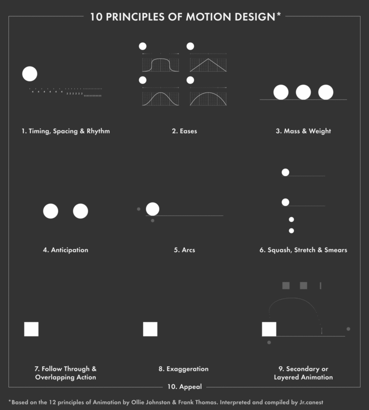
Above: 10 Principles of Motion Design.
It’s a little beyond the scope of this document to describe these interactions. There have been books written about animations. Designing Interface Animations by Val Head is my favourite. It’s not too deep and doesn’t focus on code. Instead, it shows the different ways animation can be used to generate interest and aid goal completion.
In this post, we’ve hilighted some of the main things to think about when designing for animations. As you have seen, animations can add value to any project, provided they are tasteful and don’t hide important information.
In the next post, we are going to look at some examples of animations, how long they might take to complete, and how difficult they are to implement on a site you are designing.